
Luxury Kitchen Ideas: Contrasting Porcelain Tiles in Vancouver
A statement kitchen is more than just a functional space—it’s a showcase of creativity and personal style. Central to crafting such a kitchen is the strategic use of contrast, a timeless design principle that instantly draws attention and injects character into the room. By thoughtfully juxtaposing colors, textures, and finishes, homeowners and designers can break away from the ordinary, transforming kitchens into vibrant, memorable spaces.
Porcelain countertops, with their versatility and luxurious appeal, provide a perfect canvas for experimenting with contrast. Whether you prefer a dramatic, modern look or a subtle, sophisticated ambiance, the right combination of elements can set your kitchen apart. Bold contrasts, such as pairing deep, dark surfaces with light cabinetry or mixing glossy finishes with matte textures, foster a dynamic environment that catches the eye and sparks conversation.
For residential and commercial property owners, as well as architects and interior designers in Vancouver and North Vancouver, embracing contrast is an effective way to infuse luxury and uniqueness into kitchen projects. The result is a kitchen that doesn’t just serve meals—it makes a striking visual statement and becomes the heart of any home or business.
The Power of Contrast in Modern Kitchen Design
- Contrast highlights focal points (islands, backsplashes)
- Adds depth and visual interest
- Prevents a flat, monotonous look
- Enhances the perception of space and light
- Lends a designer, high-end feel to the kitchen
Contrast is a driving force behind visually compelling kitchen designs. By emphasizing differences—whether in color, texture, or finish—designers create focal points that attract attention and add personality to the space. A well-placed contrast, such as a bold island in a sea of neutral cabinetry, becomes an instant centerpiece, anchoring the design and guiding the eye.
This interplay of opposites also adds depth and dimension. Instead of blending together, surfaces pop against one another, making the kitchen feel more dynamic and layered. For instance, contrasting a matte countertop with glossy cabinets elevates even the simplest layouts, avoiding the flatness that can come from using similar tones and textures throughout.
Moreover, contrast can manipulate the perception of space and light. Lighter tones can make a compact kitchen appear larger and brighter, while darker elements ground the room and add richness. The result is a kitchen that feels both expansive and intimate, practical and luxurious—a balance that speaks to modern interior design ideals.
Ultimately, embracing contrast not only adds aesthetic value but also infuses kitchens with a designer touch that resonates with those seeking truly unique, high-end interior design solutions.
Striking Combinations: Dark Porcelain Countertops with Light Cabinetry
- Explain the appeal of dark countertops with light cabinets
- Discuss modern and luxurious aesthetics
- Provide examples: black marble-effect, charcoal finishes
- Highlight how this combo creates focal points
- Suitability for residential and commercial kitchens
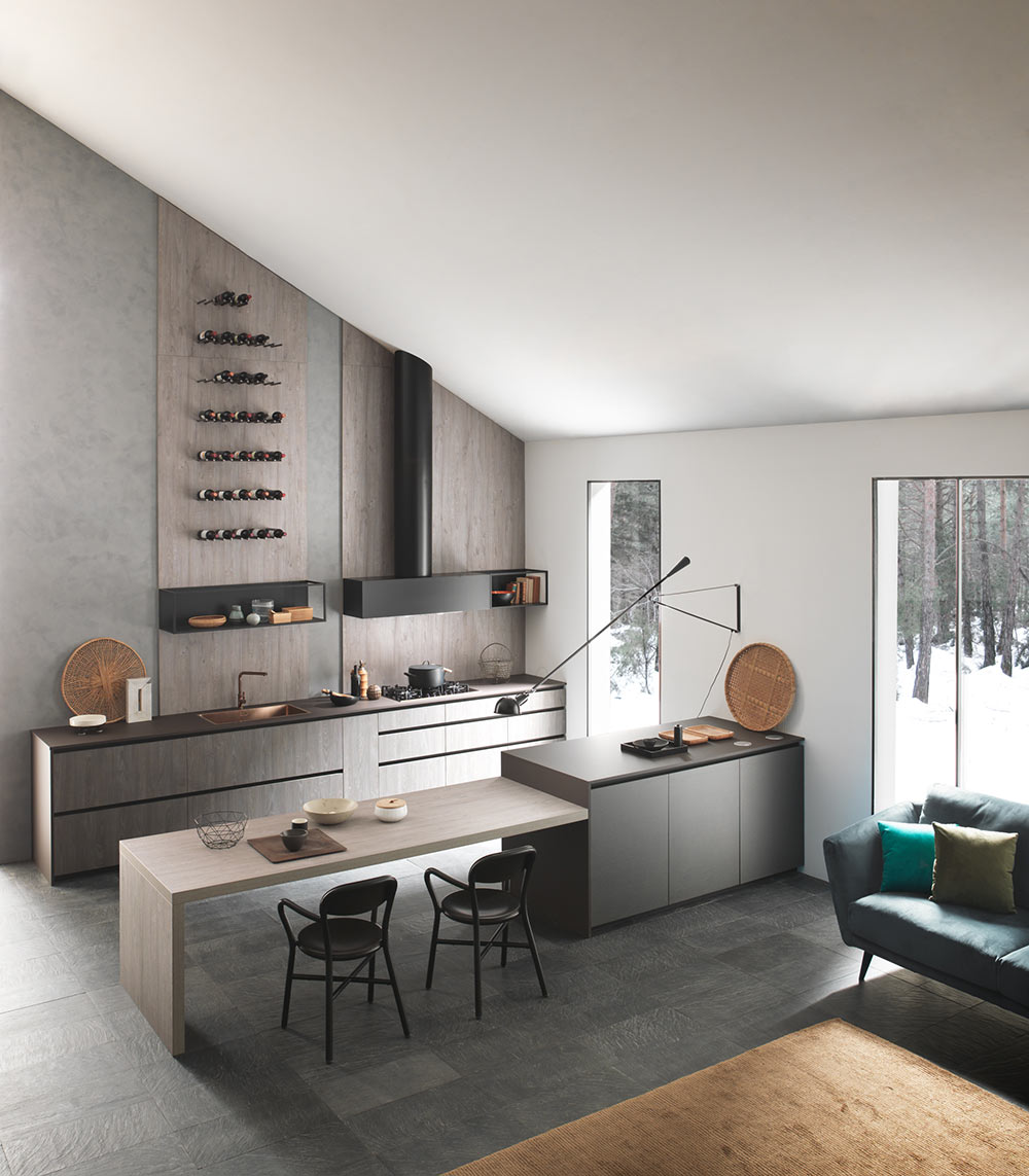
One of the most visually impactful ways to use contrast in the kitchen is by pairing dark porcelain countertops with light cabinetry. This combination exudes sophistication and modernity, creating an immediate sense of luxury. The deep, inky tones of black marble-effect porcelain, for example, stand out sharply against crisp white or soft beige cabinets, crafting a dramatic focal point that draws the eye.
Textures can further enhance this effect. A rugged, charcoal porcelain slab introduces industrial flair, especially when set atop minimalist, neutral cabinetry. The tactile nature of such surfaces adds richness, making the countertop not just a work surface, but a statement piece.
This approach isn’t limited to residential kitchens—commercial spaces benefit from the same visual impact. The contrast between dark and light signals intentional design choices, making the kitchen feel curated and high-end. It’s a strategy that works beautifully in open-plan spaces, where the kitchen’s bold features can be appreciated from multiple angles.
By choosing large format porcelain tiles for countertops, designers can achieve seamless, uninterrupted surfaces that emphasize the grandeur of the contrast, reinforcing the luxurious atmosphere that discerning homeowners and professionals seek.
Elevating Style: Light Porcelain Countertops with Dark Cabinets
- Highlight the classic appeal of light countertops with dark cabinetry
- Discuss how this combination brightens the space
- Mention examples: white marble-look slabs, warm whites
- Explain the effect on kitchen ambiance (clean, elegant)
- Applicability to various kitchen styles and sizes
For those drawn to timeless elegance, light porcelain countertops paired with dark cabinetry offer a refined and inviting aesthetic. This classic combination is celebrated for its ability to brighten the kitchen, reflecting natural light and making even compact spaces feel open and airy. The gentle gleam of a white marble-look porcelain slab, for instance, instantly lifts the mood of the room, while providing a crisp contrast to deep walnut or black cabinets.
Warm, soft-white finishes like frosty porcelain create a welcoming, cozy atmosphere without sacrificing sophistication. These surfaces harmonize beautifully with dark-toned cabinetry, adding a layer of visual interest and preventing the space from feeling too heavy or closed in.
This style is remarkably versatile, suiting both traditional and contemporary kitchens. The clean lines and bright surfaces evoke a sense of order and luxury, while the dark cabinetry grounds the design, making it feel purposeful and cohesive.
Whether you’re updating a downtown Vancouver loft or designing a spacious family kitchen, this approach delivers a harmonious blend of light and depth, ensuring the kitchen remains both functional and stunningly stylish.
Playing with Finish: Glossy vs. Matte Surfaces for Visual Impact
- Explore the impact of mixing glossy and matte finishes
- Matte countertops with high-gloss cabinets: modern, sophisticated look
- Glossy countertops with matte cabinetry: elegant, understated appeal
- Discuss how finishes affect light and texture
- Tips for balancing finishes for a cohesive design
Beyond color, the finish of surfaces plays a pivotal role in defining a kitchen’s character. Mixing glossy and matte finishes introduces a subtle yet striking layer of contrast that can dramatically elevate the space. For instance, matte porcelain countertops paired with high-gloss cabinetry create a sophisticated, ultra-modern effect. The soft, low-sheen surface of the countertop absorbs light, while the cabinets reflect it, resulting in a dynamic interplay that enlivens the entire kitchen.
Conversely, glossy porcelain countertops atop matte-finished cabinets offer an elegant, high-end look. The lustrous surface draws attention and adds a sense of luxury, while the understated cabinetry grounds the design, preventing it from feeling overly flashy.
The strategic use of finishes affects not only aesthetics but also the perception of space. Glossy surfaces can make a kitchen feel larger and more open by bouncing light around the room, whereas matte finishes provide a tactile, inviting quality.
For a cohesive design, consider the kitchen’s natural light and overall color palette. Balance is key: too many glossy surfaces can overwhelm the senses, while an excess of matte may appear flat. By thoughtfully combining finishes, you achieve a kitchen that is both visually engaging and harmoniously styled.
Enhancing Depth: Contrasting Wall and Floor Tiles in the Kitchen
- Importance of wall and floor tile contrast in kitchen design
- Neutral countertops with bold wall tiles for focal points
- Sleek countertops with textured floor tiles for depth
- How tile contrasts add layers to the design
- Large format tiles for seamless, luxurious appearance
The kitchen’s visual impact isn’t limited to countertops and cabinetry—wall and floor tiles play a crucial role in creating depth and interest. By introducing contrast between these surfaces, designers can craft layered, multidimensional spaces that captivate at every glance.
One effective strategy is to pair neutral porcelain countertops with bold, statement-making wall tiles. Vivid colors, intricate patterns, or textured finishes on the walls create dramatic focal points, turning backsplashes into works of art. This approach is especially popular in kitchens where the goal is to add personality without overwhelming the space.
Alternatively, combining sleek, large format porcelain countertops with textured or patterned floor tiles enhances the design’s depth. The contrast between smooth, uninterrupted surfaces above and tactile, visually interesting flooring below draws the eye through the room and grounds the overall aesthetic.
Large format tiles are particularly valuable in these applications—they minimize grout lines, offering a seamless, high-end appearance that’s both easy to maintain and visually stunning. For property owners and designers in Vancouver, this technique allows for creativity while ensuring the kitchen remains cohesive and luxurious.
Why Porcelain Countertops Are the Ideal Choice for Elegant Kitchens
- Durability and resilience of porcelain
- Versatility in design (marble, concrete, textile looks)
- Compatibility with contrast-focused designs
- Sustainable and low-maintenance qualities
- Contribution to luxury, functionality, and style
Porcelain countertops have rapidly become a favorite among discerning homeowners, architects, and designers seeking the perfect blend of beauty and performance. Renowned for their durability and resistance to scratches, stains, and heat, porcelain surfaces offer enduring elegance that withstands the demands of busy kitchens.
The versatility of porcelain is one of its greatest strengths. It can authentically mimic natural materials such as marble, concrete, or even textiles, providing endless design possibilities. This adaptability makes it an exceptional choice for contrast-focused kitchens, as it allows for bold pairings—light against dark, glossy against matte, textured against sleek—without compromising on durability or maintenance.
Porcelain is also an environmentally friendly option, often produced using sustainable practices and advanced manufacturing technology. Its non-porous surface resists bacteria and is effortless to clean, contributing to a healthier, low-maintenance kitchen environment.
For those aiming to create a kitchen that is as functional as it is luxurious, porcelain countertops deliver on every front. Their ability to serve as both a practical work surface and a design centerpiece makes them a cornerstone of modern, elegant kitchens across Vancouver and beyond.
Achieving a Visually Stunning and Functional Kitchen with Contrasting Designs
- Recap the value of contrast in kitchen design
- Combining countertops, cabinetry, and tiles for maximum impact
- Balancing style with functionality
- Tips for implementing contrast in your own kitchen
- Final thoughts on achieving luxury and uniqueness
Contrast is the secret ingredient that transforms kitchens from ordinary to extraordinary. By thoughtfully combining porcelain countertops with contrasting cabinetry and tiles, designers and homeowners can create spaces that are not only visually stunning but also highly functional.
The key is to balance bold design choices with practical considerations. For example, using dark countertops to anchor light cabinets or vice versa creates a strong visual statement, while mixing glossy and matte finishes introduces sophistication and depth. Similarly, pairing neutral countertops with dramatic wall or floor tiles allows for creativity without sacrificing cohesion.
When implementing contrast in your kitchen, start by selecting a primary element—such as the countertop or cabinetry—as your focal point. Build around this with complementary hues and textures, always keeping the overall flow and balance in mind. Don’t be afraid to experiment with large format tiles, which provide a seamless and luxurious foundation for any design.
Ultimately, the art of contrast allows you to personalize your kitchen, achieving a look that’s both timeless and on-trend. With careful planning and high-quality materials, it’s possible to realize a kitchen that is as unique and luxurious as the people who use it every day.
Recent Comments